FIXT
IDENTITY
Why?
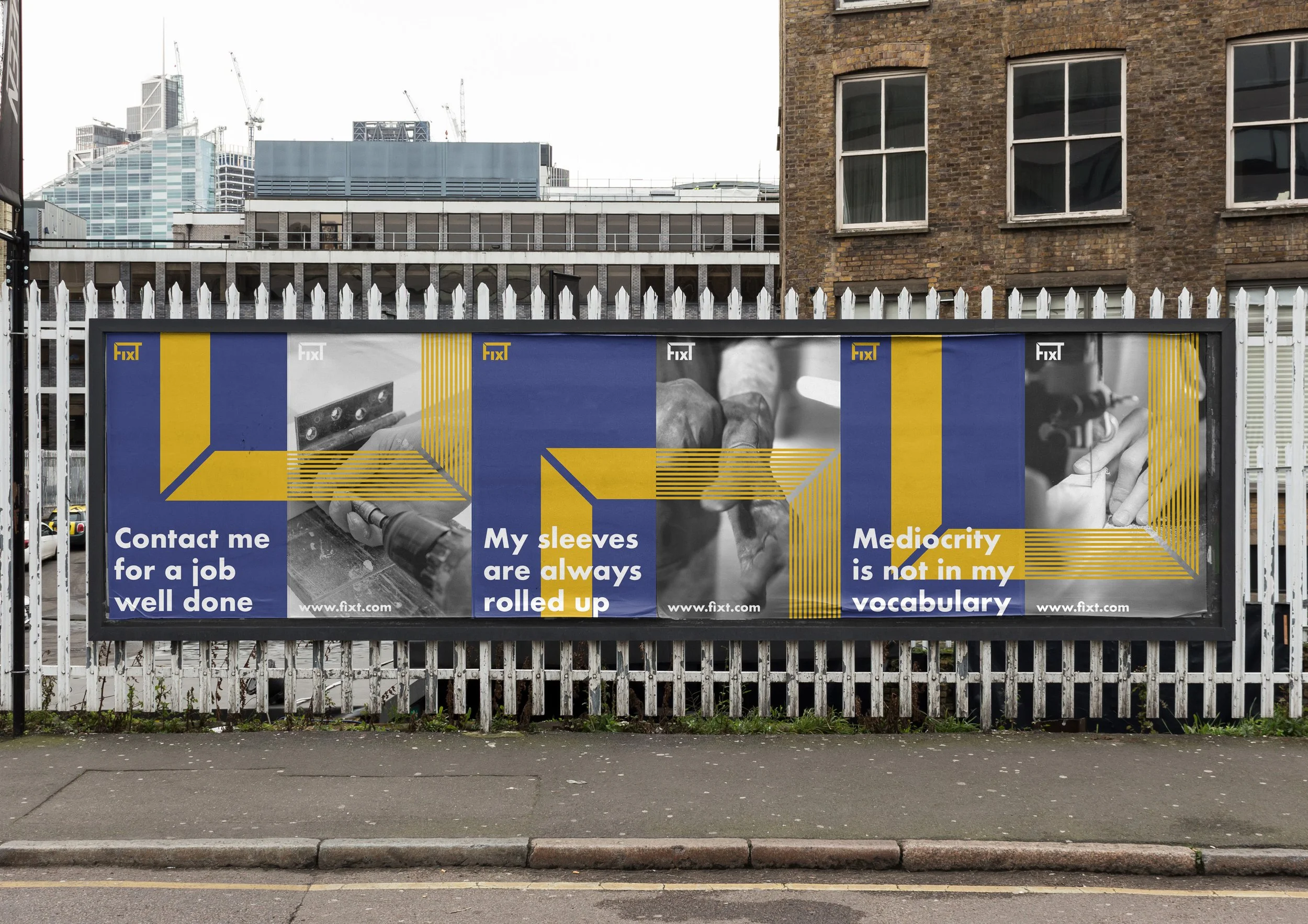
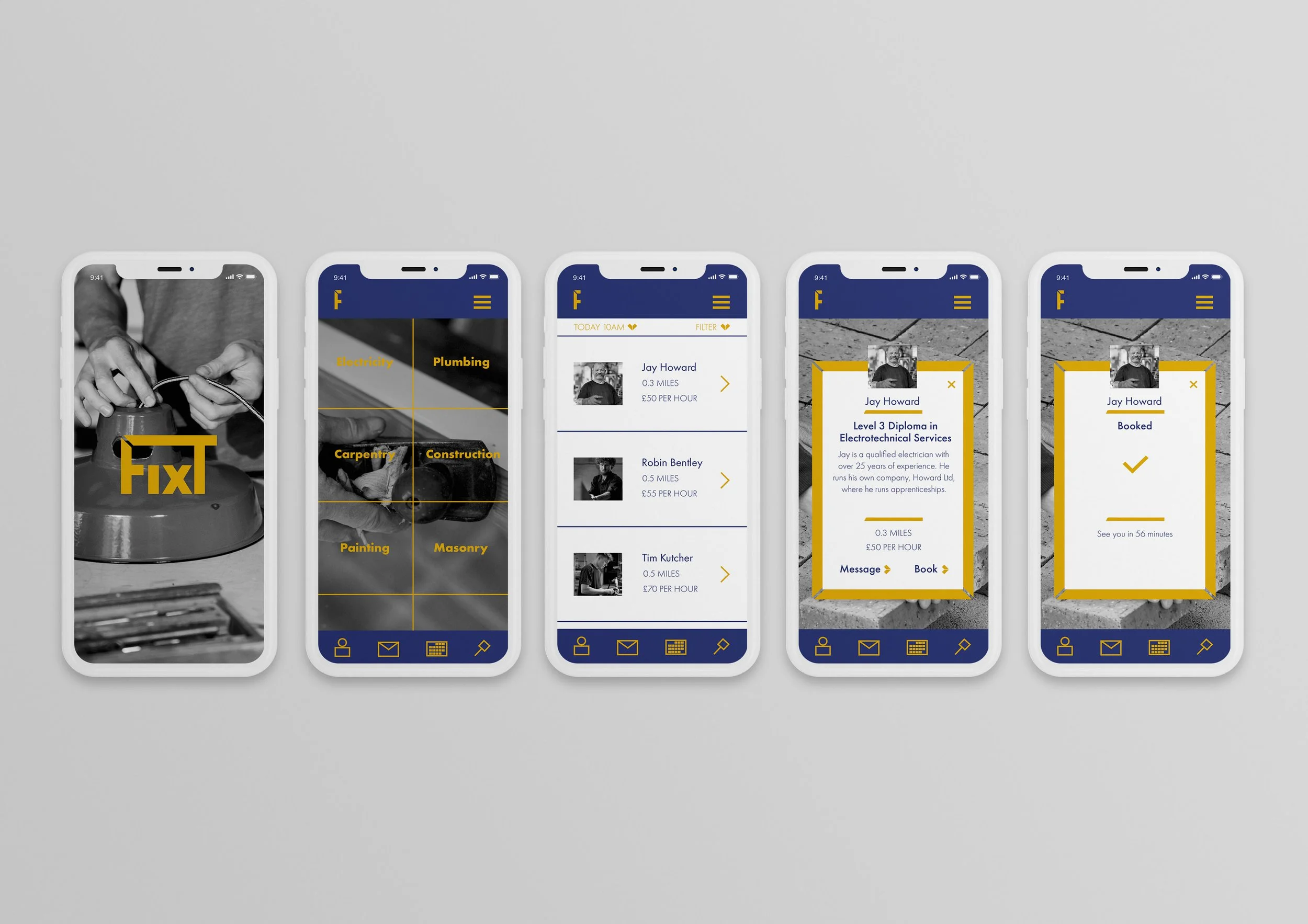
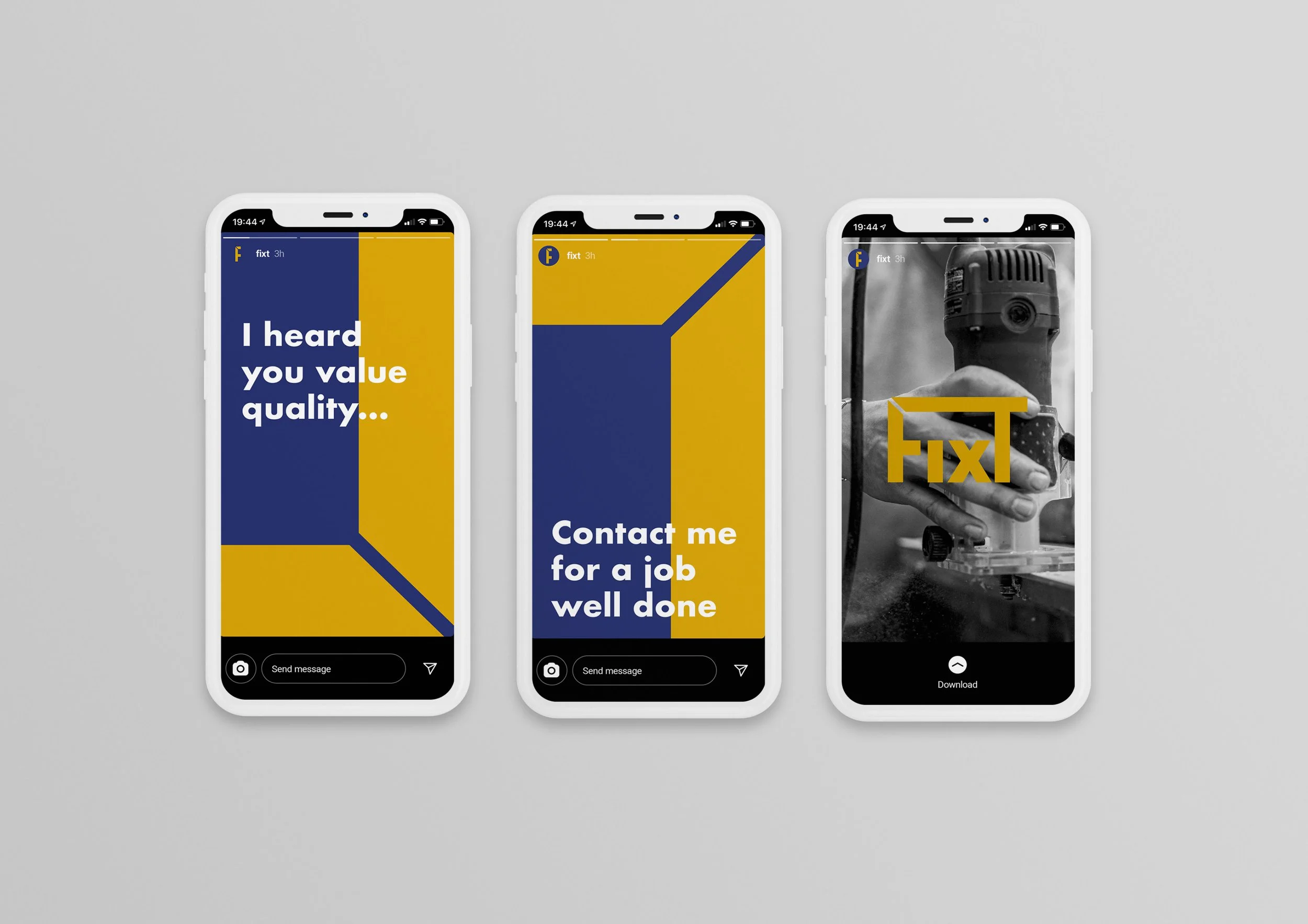
To create a new app based service connecting highly skilled handypeople to customers. The app is aimed at tech savvy people who value trust, accessibility and quality.
How?
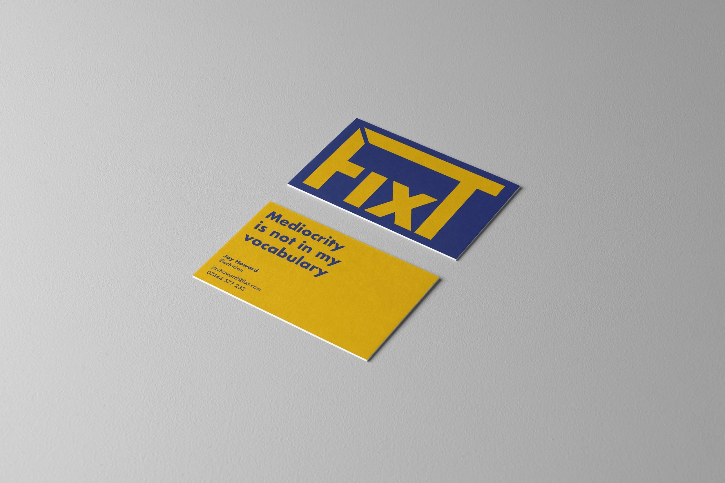
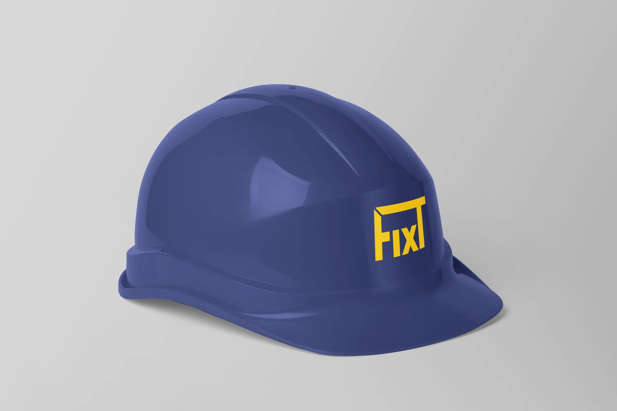
Sturdy. Sharp. Aligned. The mitre joint, a joint made by cutting two parts at a 45 degree angle, inspired the branding’s graphic elements as it represented the workforce and customers’ aligned value towards quality. The name came from morphing together the words ‘fixed’ and ‘fixture’. Blue and yellow are used to demonstrate trust and optimism. The black and white image treatment mimics being straight to the point and the focus on the hands reinforces the message of quality in the workforce.