EVENT BRANDING
Access Architecture
Why?
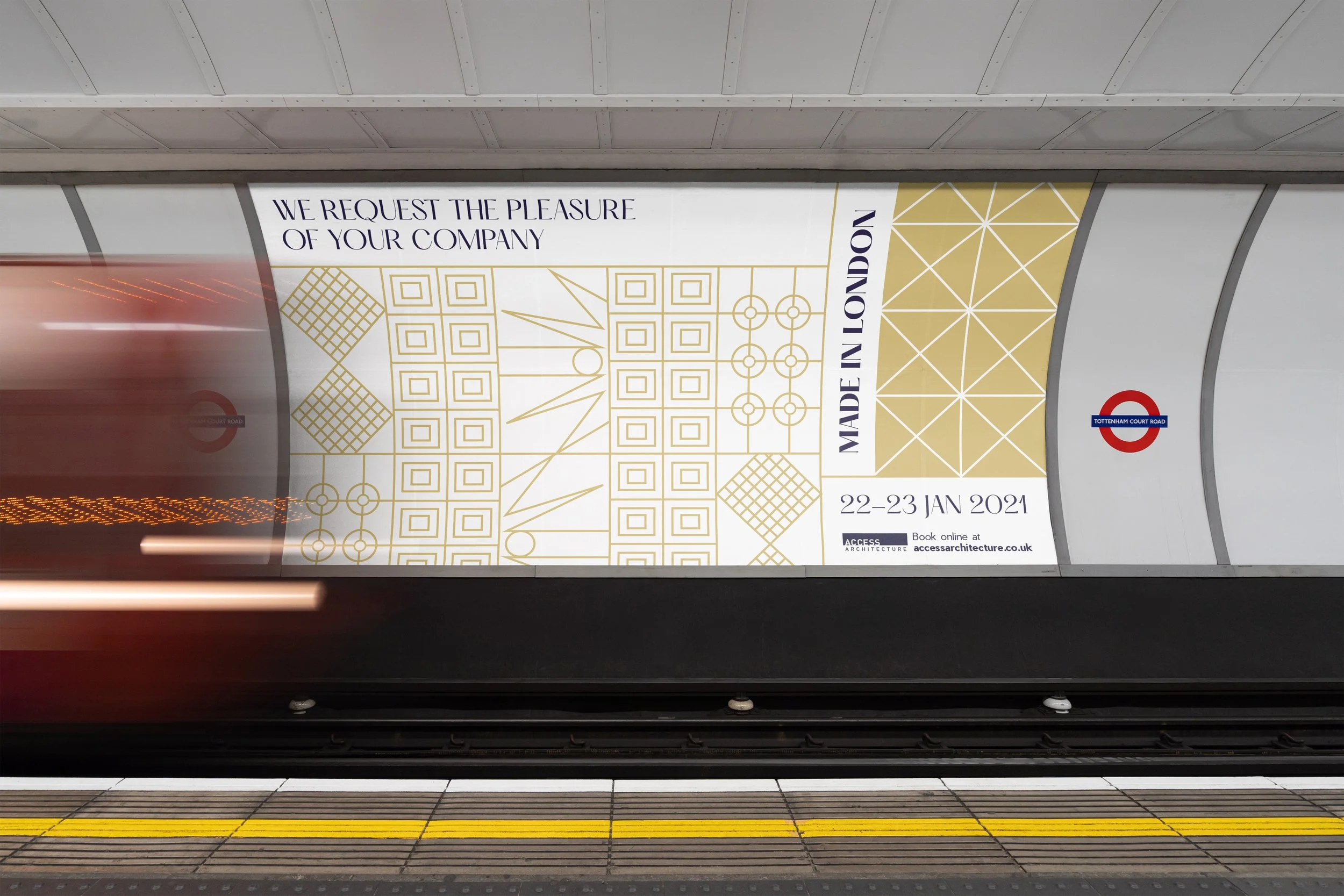
To promote upcoming weekend events in London for Access Architecture’s walks and tours. The aim is to create intrigue and excitement since the events are targeted at the wider public such as culture vultures and tourists rather than solely individuals in the architectural field.
How?
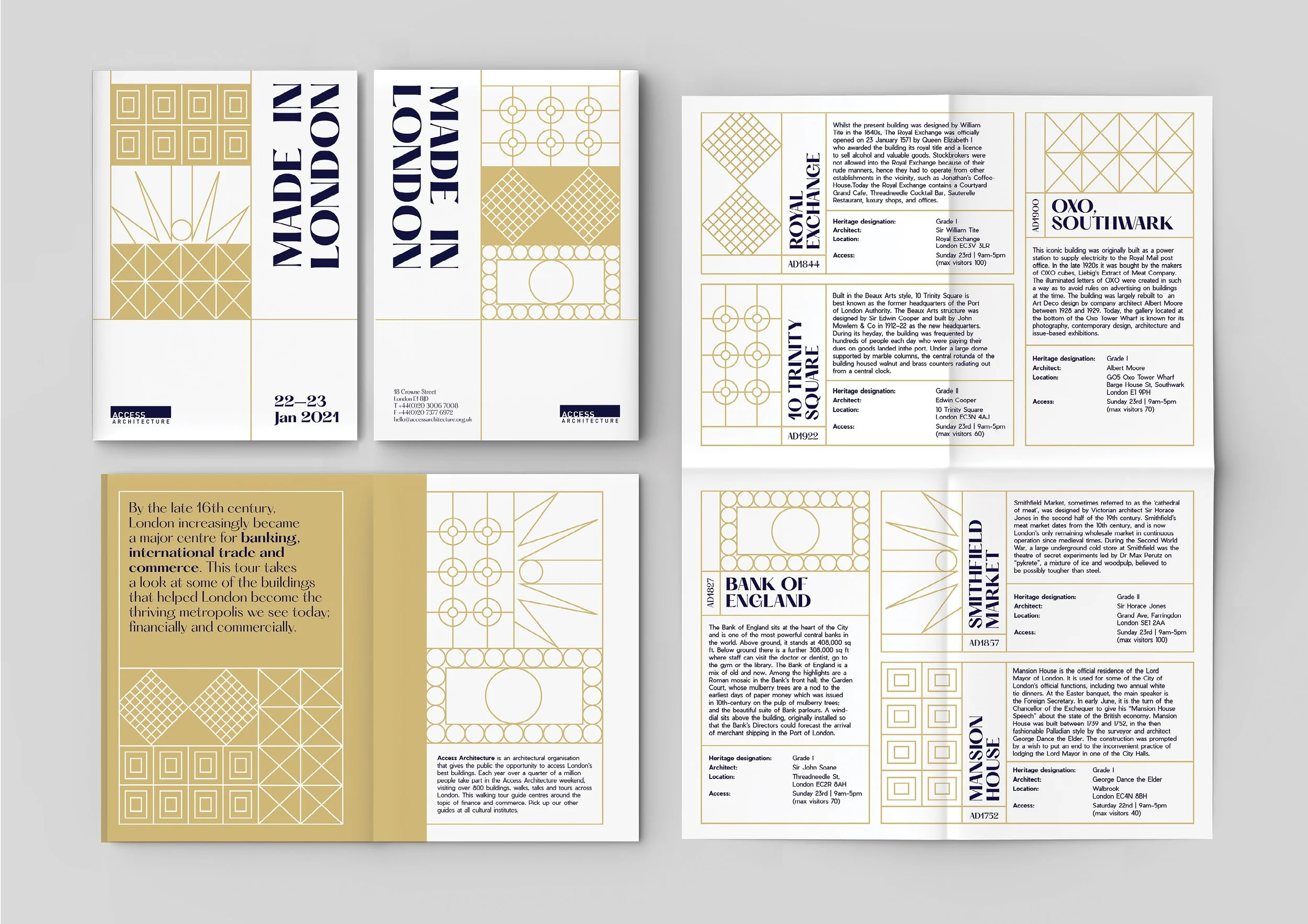
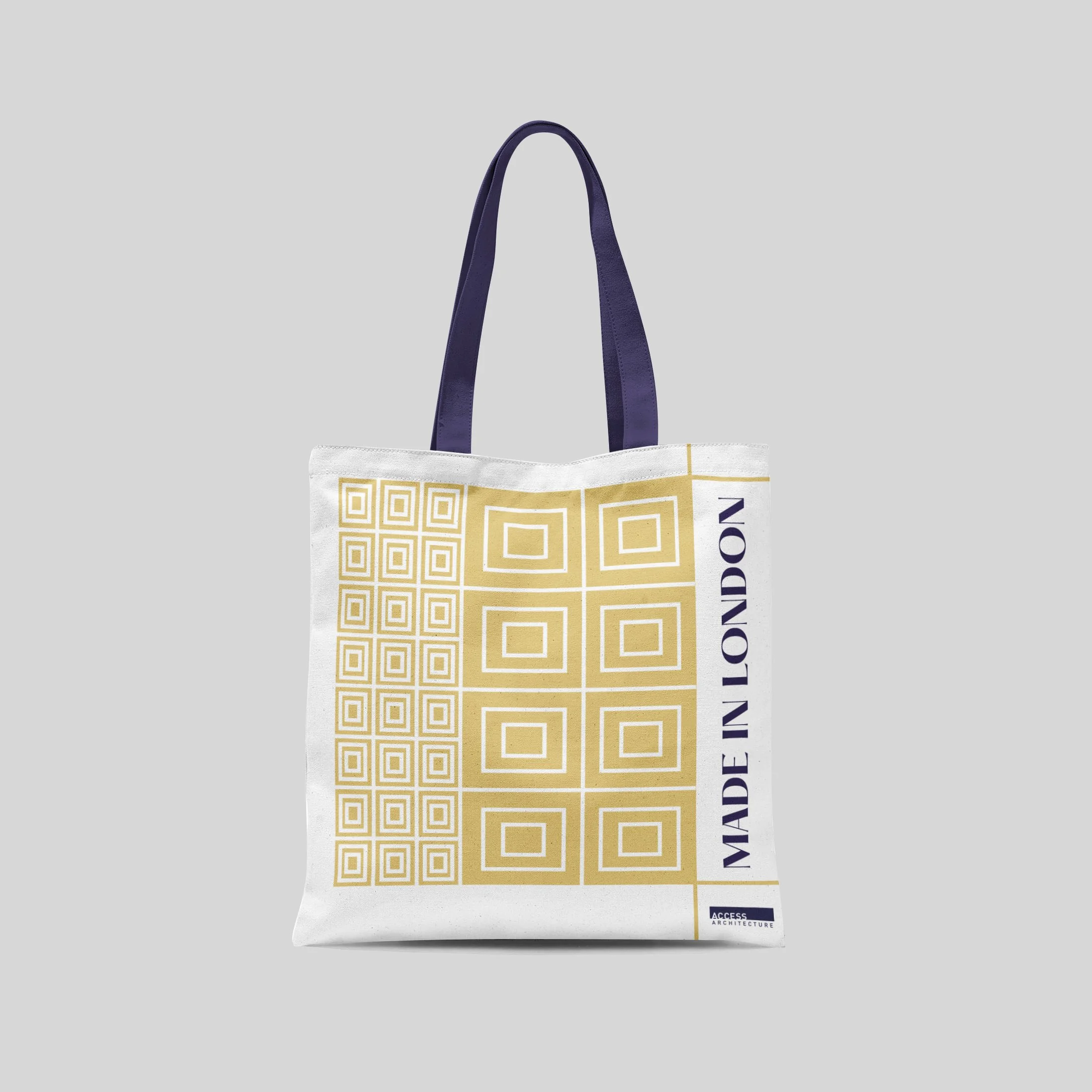
Powerful. Ceremonial. Geometric. The visual identity is inspired by a distinct geometric feature from each location on the tour. The visual elements are boxed in to act conventional and represent tradition, linking to the identity’s ceremonial perspective. Historical type, Hatton, was paired with Pier Sans as inspired by event posters in the early 1900s. The colours are reflective of the plaques around London and the royal colours.


